From time to time, it's nice to look at a series of graphs, and let them tell their thousand words worth – each – of stories. In this case, I started out looking at US monetary base at the St.Louis Fed website and it sort of went from there. Curious trends and intriguing numbers, beyond what I would have thought. To refresh memory and avoid confusion, first a few definitions:
The monetary base – base money, money base – is the sum of currency circulating in the public and commercial banks' reserves with the central bank. The money supply – money stock -, on the other hand, is the sum of currency circulating in the public and non-bank deposits with commercial banks, a.k.a. the total amount of monetary assets available in an economy at any given time.
Some additional useful definitions from Wikipedia:
" … the ratio of [the monetary base and the money supply] is referred to as the money multiplier. If one excludes currency from the definitions, the monetary base is not a subset of the money supply – rather, the two are disjoint sets. On the commercial banks' balance sheets, the former belongs to the assets whereas the latter belongs to the liabilities.
• M1: The total amount of M0 (cash/coin) outside of the private banking system plus the amount of demand deposits, travelers checks and other checkable deposits
• M2: M1 + most savings accounts, money market accounts, retail money market mutual funds, and small denomination time deposits (certificates of deposit of under $100,000).
Ironically, Wikipedia also states: "Normally, the money supply exceeds the monetary base by far…". Well, we're not in Kansas anymore.
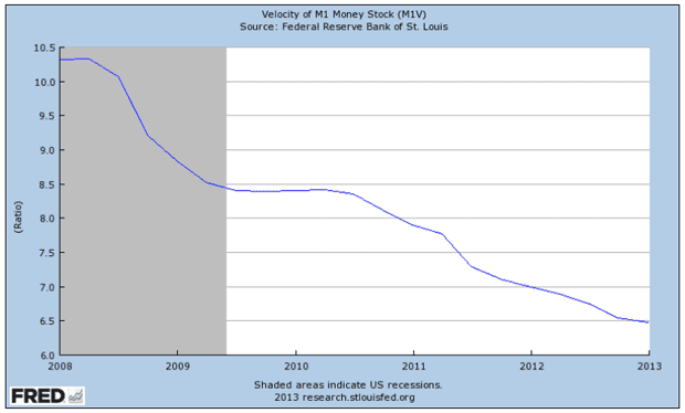
Two M1 graphs that I posted before in Deflation By Any Other Name Would Smell As Foul tell a first part of the story:


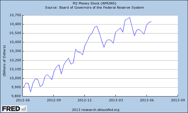
Of course, more information than from just M1 can be derived from M2, where the money supply looks different (no sudden shrinkage):

But the velocity does not (Do note the different time scales for these and other graphs):

Even more interesting than the money supply, however, is the monetary base (I used a very long timeline to show how out of – historical – proportion it has gotten):

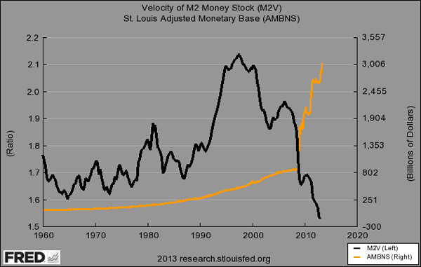
And it gets real curious when we put monetary base and M2 Velocity together:

Velocity rose like crazy in the '90s. Ever since, the Fed, the government and the entire economy have basically been pushing on a string (or have they?). Velocity hasn't been this low in 50-odd years, since it started being recorded (and that included quite a few other crises). But $2.2 trillion in stimulus, much of it QE, has found its way from the Fed into the reserve accounts the major global banks have with the same Fed. And it's not moving one inch. Indeed, these banks, who got the funds from the Fed, are receiving interest payments on them from that very same Fed.
So has Bernanke been pushing on a string? Well, if and when the velocity of money plummets the way the graphs show, it's obvious nothing is helping to get the QE funds into the real economy. Bernanke knows this, and he too has seen the graphs and the trendlines. But he still continues to pour $1 trillion per year into this same sinkhole. What it then comes down to may be that while the Fed can claim innocence and say it only tried to energize the economy, that is all just sleight of hand. Because this looks a lot like one huge money transfer from the public to the private sector, and one that has little to no chance of achieving the advertised goals.
The net effect, if this continues, will be to further bankrupt an already bankrupt society. If you look at it that way, it no longer appears so innocent. If anything, it looks an awful lot like Japan. And that means all the news reports that suggest an improving US economy need to be taken with a whole lot of roadsalt: there can be no economic recovery with a plunging money velocity. And whatever Bernanke may claim he has done about that, even if he actually tried, nothing has worked.
Another way to look at it is through this H.8;Zero Hedge graph, which compares total bank deposits with loans (left scale). Until 2008, they ran together, but ever since, a $2 trillion gap was established (right scale). Take it one step further and you could say that with a 10% reserve requirement, banks could potentially lend out $20 trillion. But they don't. Moreover, unless deposits include the QE money banks have parked at the Fed (but that would be weird), they've not just seen the deposits/loans gap grow by $2 trillion, they also acquired another $2 trillion in QE from the Fed. $4 trillion available, but no change in credit for the real economy. What do you call that, nice job if you can get it?! Or is it something worse?

The dislocation between loans and deposits is not the only one of its kind. Another thing that struck me when flipping through these graphs concerns the "dislocation" between the monetary base and gold prices. The graph below (I forget where I found it) shows the tight correlation between the two from 2008 until 2012 (and a somewhat looser correlation before).

But if we look once more at the monetary base graph from before, we see it surged a lot more from where the graph just above left off (early 2012):

While gold has moved sharply in the opposite direction:

I don't claim to know exactly what this gold/monetary base dislocation is telling us, but it does look significant. Did central banks sell off gold, in which case it's pretty straightforward, or was it someone else? We do know that wherever the difference went, it wasn't stocks or bonds. Nor is there any other obvious place it went to. It may well have simply vanished, in a strong bout of deleveraging (debt deflation).
What I think should be crystal clear is that Ben Bernanke must be forced to stop his QE policies. It is abundantly obvious that none of it helps the real economy one iota, and if it doesn't help, it hurts. I've read it estimated that 86% of QE has so far ended up in banks' reserves with the Fed, and for all I can see it may be even worse. That is not an economic stimulus, it's something entirely different. If only 1 in 7 dollars spent has any effect on Main Street at all, it is at best the proverbial "throw it at the wall and see what sticks".
Lest we forget, consumers still make up 70% of GDP, and if you want to know how that is going, you need look no further than the stats on the velocity of money. Ben Bernanke and his Fed must be aware of this, which means that what they have been doing for the past five years is either very dumb or very devious. Take your pick.
Photo top: Marjory Collins for the Office of War Information "Street vagrant pushcart" New York, 1942


Home › Forums › QE, The Velocity of Money And Dislocated Gold